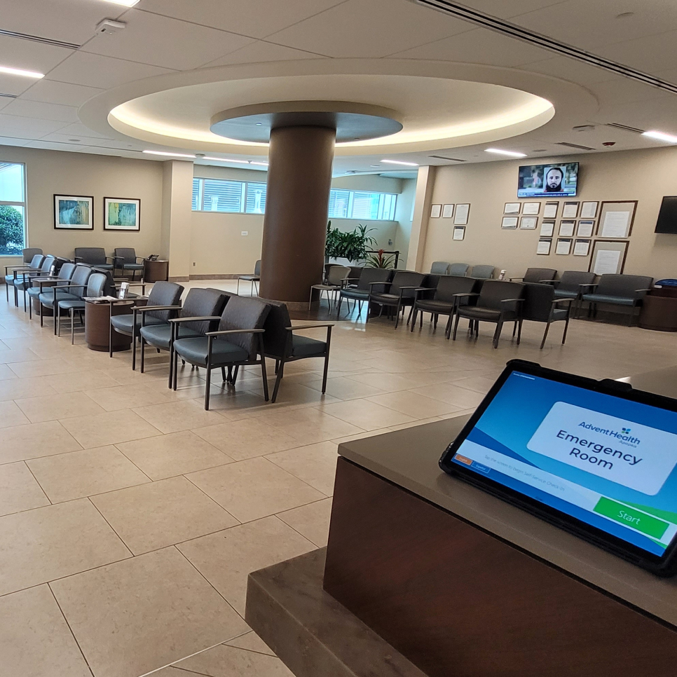
Self-Service Check-In
Refined self-service check-in kiosks for AdventHealth’s ERs, enhancing usability, consumer trust, and efficiency through UX testing and collaboration.

Project Overview
The Self-Service Check-In project aimed to introduce kiosks in emergency rooms and hospital services to streamline the check-in process for patients. As part of this "pilot" initiative, my team and I identified critical usability risks that could negatively impact consumers' experience—particularly for patients in emergency settings where ease of use is paramount.
By addressing over 300 documented usability notes and working closely with stakeholders, we ensured that high-priority issues were resolved before go-live. Beyond mitigating risks, we elevated the user experience by aligning the kiosks with AdventHealth’s brand voice and design guidelines, providing a visually appealing and trustworthy interface.
How Did the Project Start?
When I joined the project as Consumer Innovation Manager, the pilot was initially prepared to roll out across multiple service lines without comprehensive UX testing. Recognizing this as a risk, my team and I began by conducting a thorough analysis of the check-in workflow.
We meticulously documented all potential user interactions, screen workflows, personas, and errors. This audit uncovered over 300 usability risks, categorized as high, medium, and low priority. These insights formed the basis for a detailed presentation to stakeholders, emphasizing the urgency of resolving critical issues, particularly for the ER service line.
Project execution
As a leader on this project, I provided both strategic oversight and hands-on contributions to ensure its success. Key actions included:
Risk Identification and Mitigation
- Documented 300+ usability notes: 103 high, 120 medium, and 107 low priority issues.
- Collaborated with stakeholders to address high-priority issues that blocked users from successfully completing the check-in process.
- Recommended changes to reduce frustration points, improve guidance, and increase the completion rate.
Design and Brand Alignment
- Delivered copy suggestions and created background images that aligned with AdventHealth’s brand voice and visual standards.
- Built a "best case scenario" prototype to demonstrate future improvements for the product.
Testing and Documentation
- Conducted quality assessments and documented workflow changes, highlighting rationale and outcomes.
- Produced training materials for operational staff assisting consumers with the kiosks.
Operational Integration
- Assessed medical practices and hospital layouts to determine optimal device placement.
- Recommended and designed signage to improve visibility and usability of the kiosks.
What I Learned
This project reinforced the importance of detailed UX testing, particularly for high-stakes environments like emergency rooms. It demonstrated that even low-priority issues can accumulate to create significant negative impressions, especially when users are already under stress.
Additionally, I learned that collaboration with cross-functional teams—designers, developers, operational staff, and stakeholders—plays a vital role in creating a seamless consumer experience. By combining detailed analysis with user empathy, we turned a risky product rollout into a thoughtful, consumer-centric solution.


.jpg)
